05.31.12 |
Web/UI Design |
∞
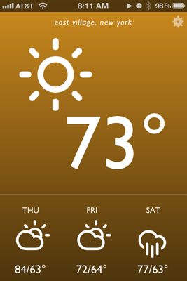
I’m pleased to launch a little project I worked on over the weekend. I called it Blue Drop, and it’s a colorful, simple weather app that’s accessible anywhere you have a web browser. It looks best on an iPhone, iPad, or Webkit (e.g. Safari, Chrome) browser on your desktop. It’s far from revolutionary, but it matches my needs and may match yours as well. On this post I want to break down how it came together and my development workflow.

To give a bit of background info, the idea of a self written weather web app or page had been ruminating in my brain for weeks. I’ve been extremely disappointed by options on the web store. Most weather apps are poorly designed, hard to read at a glance (small text is the common culprit) filled with ads, and tend to provide either too much or too little information. Then a breakthrough came last week – I spotted Degreees, a clever, CSS3 powered web app that relies on geolocation to report local temperature. I knew this was exactly the kind of direction I wanted to go in, but with my own personal spin.
Before I started designing mockups, I jotted down in iA Writer a few attributes of what an ideal weather app would have. It should be reliable and get its weather information from a great source. I’ve always been a fan of Weather Underground’s data so they were a logical choice. Their api is free for developers to try out as long as your daily query size is small. I also wanted a pared down app that gave me quick information at a glance. No maps, no extended forecasts. Just the temp, conditions, and a quick forecast of the near future. Finally, I was heavily inspired by the Windows Phone Metro style UI: big typography, big iconography and a sparse color palette.
I next used Sketch for mockups and wireframes. Based on some searching I settled on Adam Whitcroft’s gorgeous Climacons for icons, and the well tested Gill Sans for typography. Helvetica is a more readable choice but I wanted a mildly warmer and more humanist font. Development was done locally on my Macbook Air with my usual tools: Sublime Text 2, Kaleidoscope and SnapRuler.
The finished app has a few small touches that I think both add personality and increase its usability. First the background gradient changes color depending on both the time of day and the weather conditions. Sunny days have an orange hue, clouds and rain get blues and grays, and thunderstorms are purple. Daytime has bright, punchy colors while saturation and darkness decrease during the evening. The interface is also intentionally simpler than most iPhone apps – this made development and QA more straightforward as well. Everything essential is presented on app launch, and a single tap or click on one of four regions (the top conditions area and the three daily weather icons below) toggles additional detail.
There are still a few rough issues; they mostly deal with the size and space of several icon related items that I expect to touch up in upcoming weeks. For now, feel free to check it out and pass along any feedback.
05.25.12 |
∞
I dig really small, specialized web tools that do one job well. Degreees, a new temperature app, nails that pretty much perfectly. Nice job by the Finely production team here. Just head over and allow the site to scan your location. You’ll get the forecast for your area rendered with lovely CSS3.
05.23.12 |
∞
What are the future elements or tags that best support responsive images? A List Apart tackles the debate between the Responsive Images Community Group (RICG) and a browser manufacturer proposed alternative. Essential reading for web developers.
05.22.12 |
∞
Jeffrey Zeldman, talking about the (semi-controversial) redesign of his own personal site:
Even our best clients can sometimes push back, and even our most thrilling projects typically contain some element of compromise. A personal site is where you don’t have to compromise. Even if you lose some readers. Even if some people hate what you’ve done. Even if others wonder why you aren’t doing what everyone else who knows what’s what is doing.
Great points here. A lot of the work I did here on nickschaden.com was based on experimentation that I could only toy with on other paid jobs. Doing something for only yourself – a personal site, side project, something else fun on Github – is sometimes our best opportunity for growth.
05.22.12 |
∞
Panic’s much lauded web development editor Coda is getting its 2.0 release this Thursday, May 24th. Can’t say I’ve been a fan given its lack of Rails support and very tightly integrated, “all in one” design style. Nevertheless, for the right developer, especially one heavily integrated into an FTP/mySQL/LAMP stack, this could be very enticing.
Don’t forget about Diet Coda for iPad either. It’s hard for me to mentally wrap my head around coding on an iPad, but Diet Coda looks like a promising tool.
05.04.12 |
∞
Fixie is a helper JS file that interprets HTML5 tags and automatically adds the right kind of content – paragraphs, images, links and so on – in the right place. As someone who spends a lot of their day job adding in sample or filler content, this looks really helpful.
04.26.12 |
∞
Perhaps you’re reading this post, don’t know much about HTML and CSS, but want to start. Many if not most would recommend some sort of online tutorial. Based on the sample chapter I’ve read and reviews elsewhere, check out this book first. Gorgeous work and $15 on Amazon.
Granted it’s true 99% of technical books out there are outdated within seemingly a day after their publication. Yet the raw basics of HTML and CSS – markup, attributes, layout – are fairly timeless. I expect this book, for this reason and with its shallow learning curve, will last on shelves a lot longer.
04.25.12 |
∞
Jonathan Snook is a very smart, respected web developer and speaker. So why the hell didn’t I check out his SMACSS style guide earlier? Pretty brilliant stuff. SMACSS (pronounced “smacks”) is loose architectural framework for CSS. It’s a way to organize large, complex websites (e.g. my day job) in ways that maximize flexibility and reusability.
It’s effectively here in free html form which you should read pronto if CSS is important to you. If you enjoy it, go the extra mile and buy an e-book. My company has, and I’ve already easily gotten the $15 sticker price back in value about an hour of usage.
04.24.12 |
∞
Really excellent overview of how to debug and inspect CSS, HTML and JS code effectively with Chrome. A year or two ago I was a die hard (Firefox) Firebug user, but I’ve come around to the Chrome tools as my preferred toolkit for web development.
Personally my only point of contention is with the author’s support for Chrome Canary as his development platform, of which i’ve run into serious bugs, crashes and rendering problems. Instead I prefer a more moderate approach by running the Chrome Beta as my main browser. I find it’s highly stable yet you still get many of the new development features far ahead of the default Webkit releases.
04.24.12 |
∞
I found this extended look by Ars author Ryan Paul a bit overly friendly toward the internet powerhouse. It’s nevertheless pretty essential reading for any web developer. A few key trends of the piece are worth remembering; successful developers iterate often and test religiously. One other point I rarely see emphasized, but apparently critical at Facebook:
Instead of offices, Facebook developers work mostly in open spaces laid out like bullpens. Workstations are lined up along shared tables, with no barriers between individual workers. Each building has meeting rooms where employees can have discussions without disturbing other workers.
That last sentence is key. I’ve personally found development breakthroughs often come from healthy verbal debate in front of a white board, but doing so in the middle of an open plan can (understandably) disturb colleagues. Private spaces are critical.
