Movies using unorthodox aspect ratios like 4:3 and 1.66:1 have surged in recent years. Notably, this trend has grown beyond arthouse and festival circuits into mainstream releases like Longlegs, Maestro, and The Holdovers.
For the right movie, boxier ratios convey intimacy, making the shift both welcome and long overdue. The narrower and taller frame mutes the impact of landscapes, moving action, and large ensembles of actors. Characters take center stage, and this focus can make them loom larger than life. This approach harkens back to the classic 1.5:1 aspect ratio of 35mm photography, a format especially flattering for portraiture and full body shots. As director Andrea Arnold notes, who has favored the 4:3 ratio for her films, people are “not small in the middle of something.”
It’s understandable that several of my favorite recent films using 4:3 or 1.66:1 feature humble, low key character studies. For example, Perfect Days follows the routines of a toilet cleaner in Tokyo. The Holdovers presents a holiday-set chamber piece featuring a college professor, a few of students, and a school cook. All We Imagine As Light centers on the lives of two nurses in Mumbai.
But a shakeup in aspect ratio benefits more than small scale stories; it’s also an effective visual signifier of history. The 4:3 ratio originated in television and early studio films like Casablanca and The Third Man. When Osgood Perkins shoots Longlegs in 2:39 for present day scenes while setting flashbacks in 4:3 with rounded corners, he cleverly nods to seventies and eighties VHS horror. Bradley Cooper’s Maestro captures the Leonard Bernstein’s early days in 4:3 and black and white, matching the cinematography of the era.
All stills are property of their respective owners and are used here strictly for educational purposes only. Many shots are combined into a grid format – click or tap to enlarge.
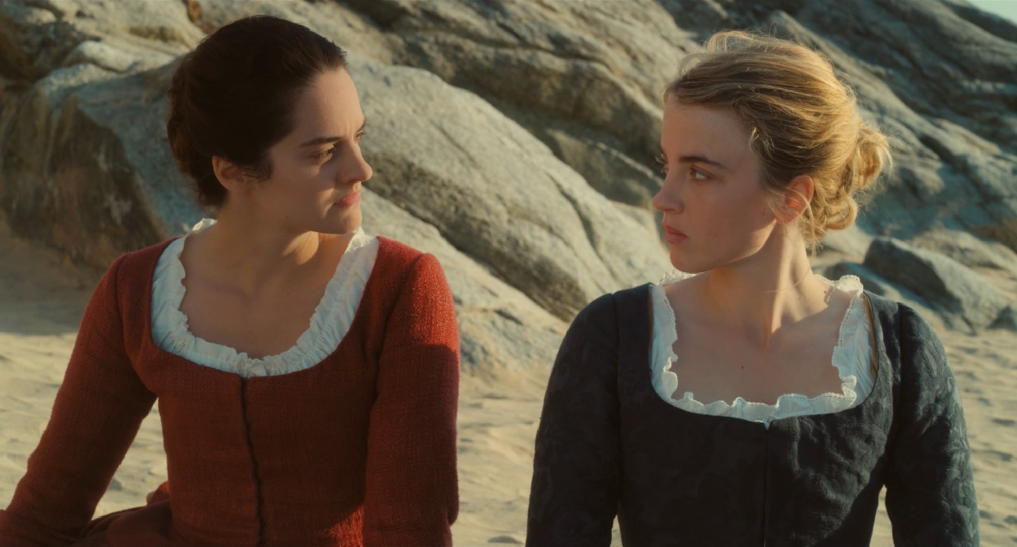
Portrait of a Lady on Fire was the last movie I saw in theaters before COVID-19 landed stateside. While I’m sad that watching movies on the big screen won’t be an option for a while, at least it ended on a high note. Portrait is an astounding film with unimpeachable craftsmanship, from acting to script and cinematography. And now, with the film’s availability on Hulu, it’s also a great film to enjoy at home. For this post, we’ll look at how the camera — its distance from subjects, characters in the frame, where, and for how long — can convey growing intimacy between characters.
What follows is light on spoilers. We’re only covering content from the first thirty or so minutes of the film, glossing over dialogue and plot developments. That said, some setup is in order: Marianne (Noémie Merlant) is commissioned to paint a portrait of a young woman Héloïse (Adèle Haenel) on an island in Brittany during the late 1700s.
All stills are property of their respective owners and are used here strictly for educational purposes only. Click or tap to enlarge.
A great opening scene grabs the audience’s attention while establishing setting, tone, and key characters in the story. Nicolas Winding Refn’s Drive does all of this while memorably defying our expectations of the action genre. When I reflect on my favorite films from the 2010s, Drive ranks high, and its opener is a significant reason why.
However, eight years removed from Drive’s debut, subverting action conventions isn’t the film’s legacy. What lingers for many is Cliff Martinez’s electronic score and Refn’s 80s visual pastiche punctuated by bursts of graphic violence. So while the general critical consensus on Drive is positive, many critics write the film off (if not Refn’s whole filmography) as self-suffocating style over substance. It’s an unfair rap because beyond the synth-heavy music and neon-drenched L.A. setting, Drive has superb craftsmanship that makes it unique and compelling today.
All stills are property of their respective owners and are used here strictly for educational purposes only. Click or tap to enlarge.
The 180 degree rule is one of the most fundamental tenants in cinematography. It’s commonplace across every genre and filmmaking style. Once you understand the basics, it’s easy to spot where it’s used and intentionally broken. This year’s excellent drama The Souvenir breaks the 180 rule in one pivotal scene we will examine here.
At its most essential, the 180 degree rule states if you were to draw an imaginary line between the two characters, the camera stays on only one side of the line for the length of the scene. The camera’s placement limitations to a 180 degree arc give the rule its name.
All stills are property of their respective owners and are used here strictly for educational purposes only. Most shots are combined into a grid format – click or tap to enlarge.
Bright is a flat out bad movie. Its screenplay has too much sophomoric dialogue and tonal whiplash. Unresolved plot threads abound. Any charisma from leads Will Smith and Joel Edgerton rarely registers above the film’s mediocrity.
Bright is also an action film with a ninety million plus budget, yet the shootouts are barely comprehensible. Fights lack a clear sense of continuity, editing, and direction. To examine how and why that is we’ll break down a single action scene midway through the film (watch the scene on Netflix; it starts at 1:01:36.)
All stills are property of their respective owners and are used here strictly for educational purposes only. Most shots are combined into a grid format – click or tap to enlarge.
Mindhunter shows how simple shot and editing techniques can elevate a series above a routine crime procedural. For this post we’ll look at one standout scene in the final episode of season one. Subtle changes in shot length, distance, and angle heighten emotions. David Fincher directs, Erik Messerschmidt serves as DP, and Kirk Baxter, who’s been Fincher’s primary editor for almost a decade, edits. (Mild spoilers follow.)
On paper the scene is a conversation between two characters that turns threatening. FBI agent Holden Ford (Jonathan Groff) profiles and studies serial killers. Incarcerated mass murderer Edmund Kemper (Cameron Britton) is Holden’s interview subject early in the season. This last scene serves as a reunion after many episodes apart; Kemper tried to kill himself, and Holden visits him in the hospital.
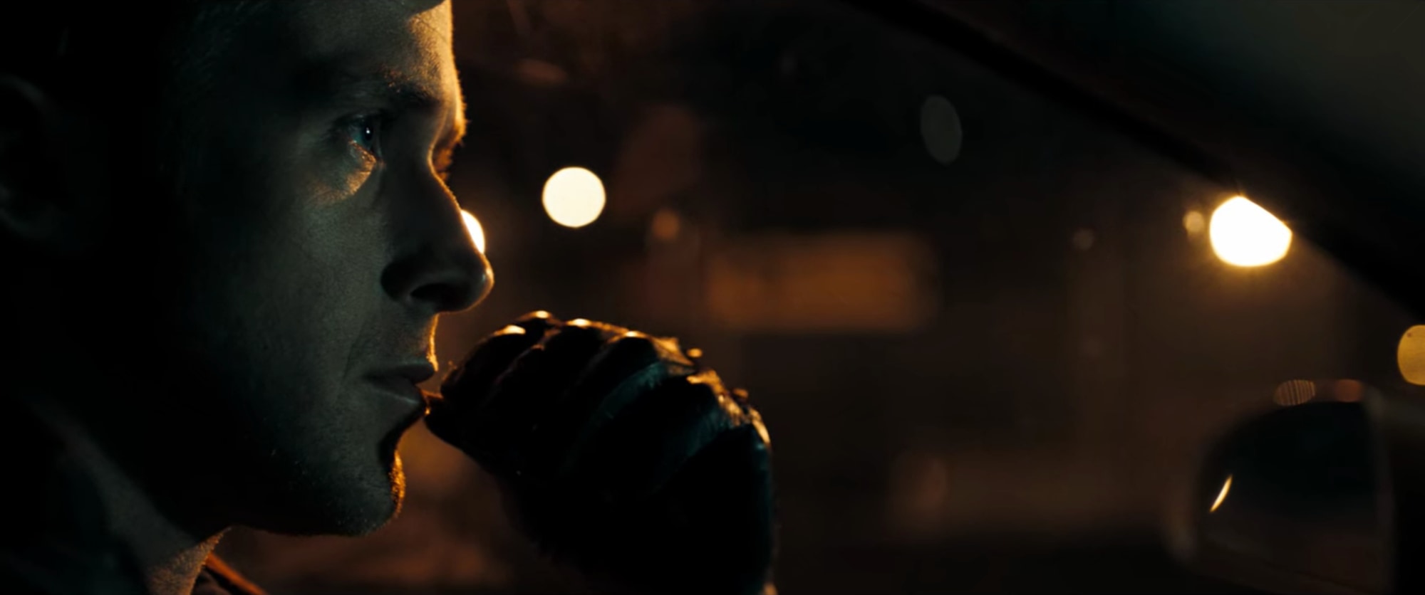
Blade Runner 2049 stands up well to the 1982 original on a surface level. The film has an immaculate sense of place; DP Roger Deakins captures future L.A. in all its neon, rain drenched glory. The production design is stunning. Yet amazing visuals can’t overpower 2049’s thin supporting characters and pacing issues.
(Major spoilers ahead for Blade Runner 2049.)
Joi (Ana de Armas) – K’s (Ryan Gosling) futuristic mashup of Stepford wife and manic pixie dream girl – encapsulates Blade Runner 2049’s character problems. She starts the film with promise; Joi opens questions on how AI intersects with love, mobility, and even societal rank (Joi is technically a slave for another artificial slave.) And in a later memorable scene, Joi uses sex worker Mariette (Mackenzie Davis) as a physical substitute for herself. Joi tries to “sync” to the movements of Mariette; the unsettling imagery of this Joi/Mariette “hybrid” making out with K has implications for identity and even future-scape pornography.
With Roger Moore’s passing, I’ve been revisiting Bond movies. Catching up with Spectre wasn’t part of the plan. It’s overly long, with a convoluted plot, some slack action scenes, and a miscast villain. Yet in terms of camera work, Spectre is stellar. I’d rank it second only to Roger Deakins’ outing on Skyfall.
DP Hoyte Van Hoytema’s lensing gives the film a different look than other Bond films. Visually it’s romantic and elegant. Yet as with Van Hoytema’s other work (Let the Right One In, Tinker Tailor Soldier Spy, Interstellar), Spectre has a dark tone. He deepens what’s an often lightweight picture with more thematic weight. (Mild spoilers for Spectre to follow.)
All stills are property of their respective owners and are used here strictly for educational purposes only. Several shots are combined into a grid format – click or tap to enlarge.
It’s easy to see why Moonlight is the most critically acclaimed film of the year. Everything just works as a complete package, with stellar acting, direction, and screenplay. Its humanistic story is memorable, emotionally complex, and subverts racial stereotypes.
Among such skill, it’s Moonlight‘s striking visuals that left the biggest impression on me. Though it has been months since my last viewing, I can recall certain shots as though I saw the film yesterday. With strong saturated colors and high contrast, Wong Kar-Wai is a clear influence. Yet interesting changes in angle, perspective, and a heavy reliance on handheld give this movie its own unique character. (Mild spoilers for Moonlight ahead.)
All stills are property of their respective owners and are used here strictly for educational purposes only. Several shots are combined into a grid format – click or tap to enlarge.
From the moment I heard La La Land talked up as a “modern” musical, I got worried. Updating older genres and tropes is en vogue these days, but it’s easy to mess up. Balance is key. Some films follow the rules of the past slavishly, making it hard for audiences to connect. Others cheat, creating an entirely modern film with a few half-hearted old school references.
Thankfully La La Land is an exception to this rule. Much of that credit goes to the film’s impeccable costuming, choreography, music, and direction. But I can’t imagine the movie fully gelling together without the skill of DP Linus Sandgren.