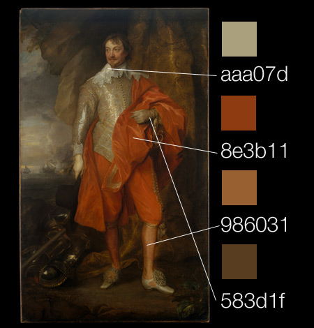
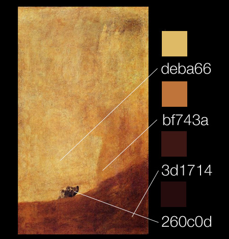
Color Inspiration from Fine Art Masters
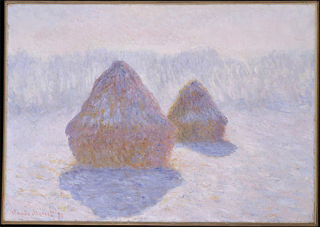 Claude Monet, Haystacks (Effect of Snow and Sun), 1891
courtesy Metropolitan Museum of Art
Color can be one of the most important creative decisions made in any web design. Whether it’s in the setting of a more sedate and controlled corporate branding, or wild and vibrant smaller sites, a shrewd and unique color palette can set apart great sites from the merely good. In this article, I examine how the masterworks of fine art can give us the inspiration behind a killer color combination.
Colors are easy, palettes are hard
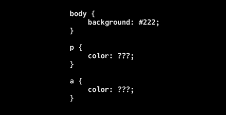 Ok, background is totally dark and brooding. but color of text, highlight colors, sidebar, hmm…
A harmonious color design is critical yet for many of us, generally difficult and time consuming, especially for developers like myself with little formalized art education. While it’s usually easy for me to decide on one or two colors that convey what I’m after, things quickly breakdown when considering a larger set of colors to comprise an entire visual style.
So, like others in need of inspiration, I drop by Colour Lovers to search for hexadecimal combos and play around in the Kuler color picker for a while. Generally however I find this process a bit cold and remote; I’ll see many pretty palettes, but I don’t know what they were used for or what their original inspiration was.
Fine art masterworks: The breakdown
A close look at the masterworks by some historical fine art masters I find often helps break out of this palette rut. The process is fairly simple:
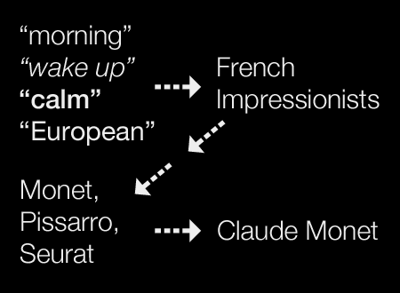
Settle on an artist, period, or exhibit that helps convey the mood you’re after.
For example, the Impressionists often focused on soft, welcoming palettes. Vermeer was famous for his domestic scenes with masterful control of light. Rembrandt was best known for his portraiture, often with rich, dark tones. If you’re stumped on where to start, go to a great resource like the Met Museum and start browsing.
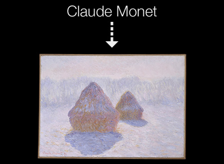
Find a painting or set of paintings that matches the focus of your design.
While this process is highly subjective, I find it easiest to go off of first impressions (e.g. “wow, that painting feels comforting”) and works where a few strong colors predominate. For this example I chose Monet’s iconic “Haystacks (Effect of Snow and Sun)”.
With a photo/scanned copy/web image of the painting in hand, open in Photoshop/color picker of your choice.
It’s easiest of course to find a copy of the painting online. However, sometimes it’s a lot more fun and inspirational to head to a local museum or art exhibit and take a few photos. Scanned museum gift shop postcards and art books also work well.
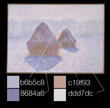 Claude Monet, Haystacks (Effect of Snow and Sun), 1891
Use the eyedropper tool (or equivalent) to start selecting a few colors to form your palette.
The color can be from anywhere, but I’d suggest focusing on colors that really leap from the image due to their sheer amount in the painting or otherwise predominate.
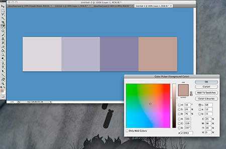
Double check your new palette against a mood board/Photoshop file/test page to make sure they work.
Some tweaking here and there is often in order (I often play with the brightness part of the HSB meter a bit in Photoshop), but often the results are pretty close to what you’re after from the start.
More fine art examples
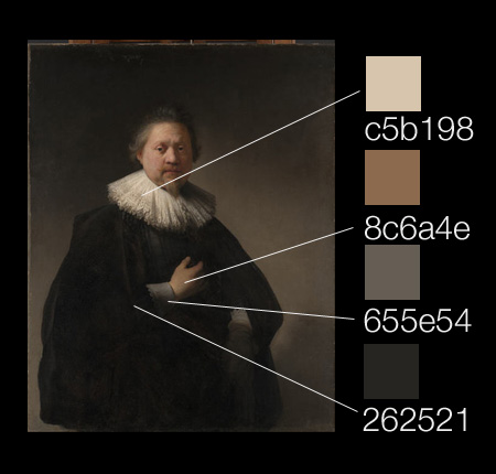 Rembrandt, Portrait of a Man, 1632
